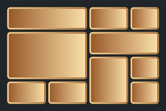
Revolutionizing Web Design: The Rise of Bento Grid Layout Design Templates
In the ever-evolving landscape of web design, aesthetics and functionality must coexist seamlessly. One of the most compelling innovations gaining traction among designers and developers is the Bento Grid Layout Design Template. This modular, geometric-based approach to web page layout not only enhances visual appeal but also improves usability and responsiveness. As businesses and creatives seek more engaging and customizable digital experiences, the Bento Grid emerges as a powerful tool in the modern designer’s toolkit.
Understanding the Bento Grid Layout Design
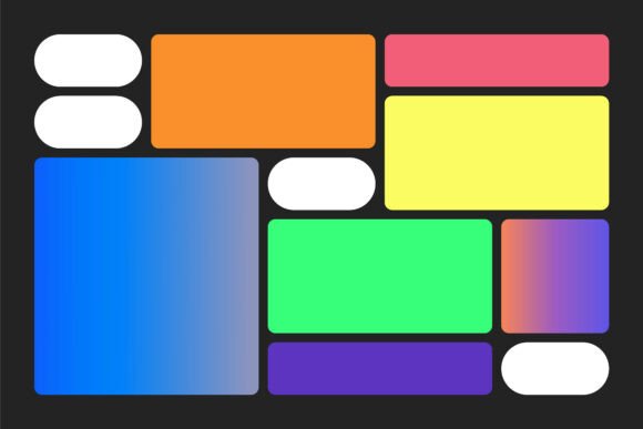
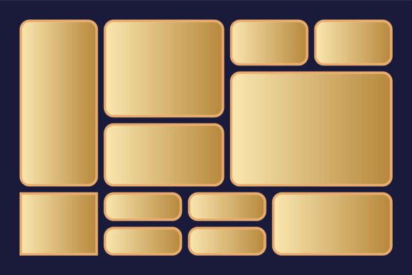
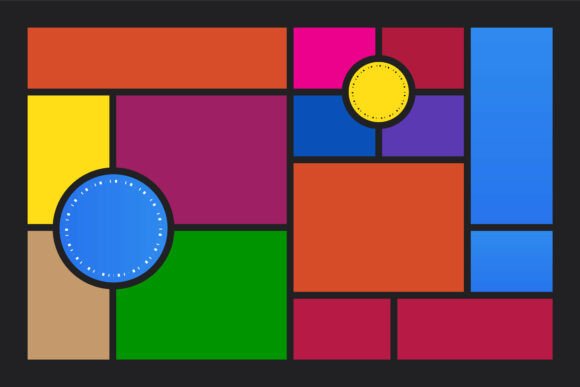
The Bento Grid Layout is inspired by the Japanese bento box, known for its compartmentalized structure. In web design, this translates to a grid system that organizes content into distinct, visually balanced blocks. Each "compartment" can house different types of media—text, images, videos, or interactive elements—while maintaining a cohesive and dynamic layout.
Unlike traditional grid systems that rely on rigid columns and rows, the Bento Grid embraces asymmetry and creative spacing. It allows designers to break free from monotonous layouts while ensuring that the page remains intuitive and easy to navigate. The Bento Grid Layout Design Template typically includes a variety of pre-designed blocks that can be rearranged, resized, and recolored to suit specific brand identities and content needs.
Why the Bento Grid is Capturing Attention
As digital experiences become more personalized and visually driven, the demand for unique, modular layouts has surged. The Bento Grid meets this demand by offering a flexible yet structured design system that can be adapted across various platforms and screen sizes. Its rise in popularity is not just a passing trend but a response to deeper shifts in how users interact with content online.
Designers and developers are increasingly prioritizing user engagement, and the Bento Grid supports this by enabling a more interactive and visually rich experience. With 100 color customizable options and fully editable vector design capabilities, the template empowers creators to build unique interfaces without compromising on performance or scalability.
Integration with Current Design and Business Trends
The Bento Grid aligns with several key trends shaping the web design and digital marketing industries:
- Modular Design Systems: Companies are adopting modular design principles to streamline development and maintain consistency across digital assets. The Bento Grid supports this by offering reusable, customizable components that can be mixed and matched.
- Mobile-First and Responsive Design: As mobile browsing continues to dominate, responsive layouts are essential. The Bento Grid’s flexible structure ensures that content adapts smoothly to different screen sizes without sacrificing visual integrity.
- Visual Storytelling: Brands are leveraging visual storytelling to create emotional connections with their audiences. The Bento Grid’s block-based format allows for curated content presentation that guides users through a narrative journey.
- Personalization: Users expect tailored experiences. With easy to resize and modify blocks, designers can create layouts that reflect individual brand personalities and user preferences.
Practical Applications of the Bento Grid Layout
The versatility of the Bento Grid makes it suitable for a wide range of applications. Here are a few examples of how it’s being used effectively:
- E-commerce Websites: Online retailers use the Bento Grid to showcase products in a visually appealing way. Each block can highlight a featured item, customer review, or promotional offer, creating an engaging shopping experience.
- Portfolio Sites: Freelancers and creatives benefit from the Bento Grid’s ability to display diverse work samples. Each block can represent a different project, with custom colors and shapes reflecting the project’s theme.
- News and Media Platforms: Publishers use the layout to present articles, videos, and infographics in a structured yet dynamic format, improving readability and user retention.
- Corporate Websites: Companies use the Bento Grid to organize information about services, team members, and company values in a visually cohesive manner.
Meeting the Changing Needs of Designers and Users
Today’s designers and users have higher expectations when it comes to website aesthetics and functionality. The Bento Grid addresses these expectations by offering a balance between structure and creativity. Its modular nature supports rapid prototyping and iterative design, which is crucial in agile development environments.
For entrepreneurs and marketers, the ability to customize and adapt layouts quickly is a major advantage. Campaigns can be launched with unique landing pages that stand out in a crowded digital space. The inclusion of source files in EPS format ensures that designers have full control over every element, from color schemes to typography.
The Future of Web Layouts with Bento Grid
Looking ahead, the Bento Grid is well-positioned to influence the next generation of web layouts. As AI and automation play a larger role in design workflows, templates like the Bento Grid will become even more valuable for their flexibility and ease of use. Designers can focus on creativity while leveraging pre-built structures that speed up development time.
Moreover, as the demand for immersive and interactive web experiences grows, the Bento Grid’s block-based approach can easily integrate with emerging technologies such as 3D elements, micro-interactions, and scroll-triggered animations. This adaptability ensures that the template remains relevant in a rapidly changing digital ecosystem.
Conclusion: A Design Tool for the Modern Web
The Bento Grid Layout Design Template represents a significant shift in how we approach web page structure and aesthetics. By combining geometric precision with creative freedom, it offers a solution that meets both functional and visual needs. Whether you're a seasoned developer, a startup founder, or a creative professional, the Bento Grid provides a foundation for building websites that are as engaging as they are efficient.
With its 100 color customizable palette, easy to resize and modify blocks, and fully editable vector design, the Bento Grid is more than just a layout system—it's a reflection of the evolving relationship between design, technology, and user experience. As the web continues to mature, tools like the Bento Grid will play a crucial role in shaping the digital experiences of tomorrow.